
How to customize the trust badges design
Overview
The Design step of the editor controls how your badges look: layout, spacing, sizes, background and colors. The template you picked sets the starting values.
The badges use your theme's font. There is no font setting; to use another font, add custom CSS (step 6).
Steps
1. Open the Design step
Open Trust Badges, click the name of your badges, then click Design at the top of the editor. Watch the Desktop Preview and Mobile Preview as you change settings.
2. Set the layout and spacing
Under General Settings:
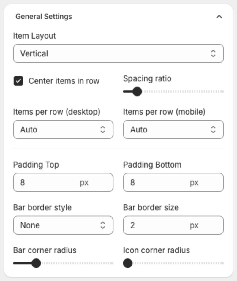
| Setting | What it does |
|---|---|
| Item Layout | Vertical puts the title under the icon. Horizontal puts the title next to the icon. |
| Center items in row | Centers the badges in their row. |
| Spacing ratio | Space between the badges. Drag the slider. |
| Items per row (desktop) / Items per row (mobile) | How many badges fit in one row: Auto or 1 to 9. |
| Padding Top / Padding Bottom | Space above and below the badges, in pixels. 8 px by default. |
| Bar border style / Bar border size | Border around the badges: None, Solid, Dotted or Dashed, and its width. |
| Bar corner radius / Icon corner radius | Corner rounding of the background and of the icons. |
3. Make the badges take less space
- Lower Padding Top and Padding Bottom, for example from 8 to 2.
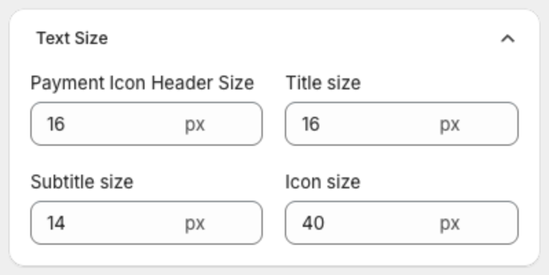
- Lower Icon size, Title size and Subtitle size under Text Size.
- On mobile, set Items per row (mobile) to show more badges in one row.
4. Set the sizes
Under Text Size, set in pixels the Payment Icon Header Size (header of payment icons), Title size, Subtitle size and Icon size.
5. Set the background and colors
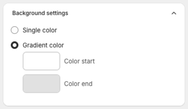
- Under Background settings, select Single color or Gradient color (Color start and Color end).
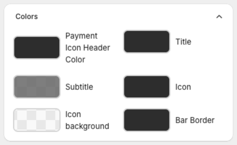
- Under Colors, click a swatch to change the Payment Icon Header Color, Title, Subtitle, Icon, Icon background and Bar Border colors.
6. Change the font or other styles with custom CSS (optional)
Under Advanced setting, add your own CSS in Custom CSS. The CSS applies only to this set of badges. Type a dot (.) in the editor to see the available CSS classes, or click Show list.
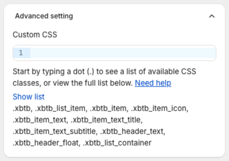
To use another font, paste this CSS and replace the font name. The font must already be available on your store, for example one of your theme fonts.
.xbtb_item_text_title,
.xbtb_item_text_subtitle,
.xbtb_header_text {
  font-family: Georgia, serif;
}
7. Save or publish
Click Save in the bar at the top of the page, or click Publish if the badges are still a draft.