
How to customize the bar design
Overview
The Design step of the editor controls how a bar looks: width, borders, sizes, text size, background and colors. Each bar has its own design. The template you picked sets the starting values.
The bar uses your theme's font. There is no font setting; to use another font, add custom CSS (step 7).
Steps
1. Open the Design step
Open Announcement bars, click the bar name, then click Design at the top of the editor. Watch the Desktop Preview and Mobile Preview on the right as you change settings.
2. Set width, borders and sizes
Under General Settings:
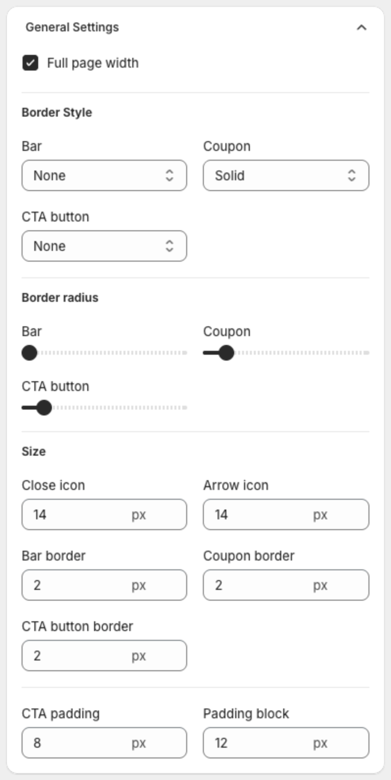
| Setting | What it does |
|---|---|
| Full page width | Stretches the bar across the full width of the page. |
| Border Style | Border line of the Bar, the Coupon box and the CTA button: None, Solid, Dotted or Dashed. |
| Border radius | Corner rounding of the Bar, the Coupon box and the CTA button. Drag the slider. |
| Size | Sizes in pixels: Close icon, Arrow icon, Bar border, Coupon border, CTA button border, CTA padding and Padding block (space above and below the text — it sets the bar height). Set Arrow icon to 0 to hide the arrows. |
3. Set text sizes
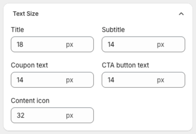
Under Text Size, set the size in pixels of the Title, Subtitle, Coupon text, CTA button text and Content icon.
4. Make the bar shorter or taller
The height of the bar comes mostly from Padding block under General Settings > Size. It is the space above and below the text, 12 px by default.
- Lower Padding block, for example from 12 to 4, to make the bar shorter. Raise it to make the bar taller.
- If the bar is still too tall, lower the Title and Subtitle sizes under Text Size.
- If the bar has a button, lower CTA padding too. A large button makes the whole bar taller.
Check the Desktop Preview and Mobile Preview after each change.
5. Choose the background
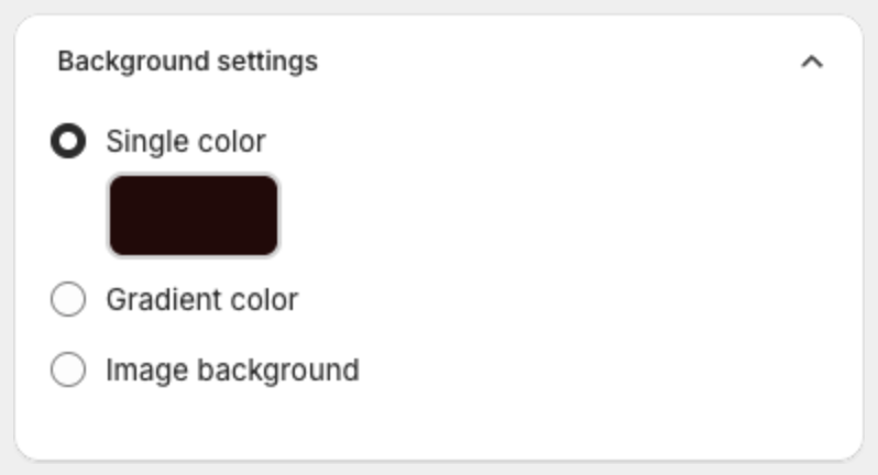
Under Background settings, select:
- Single color — one color. Click the swatch to pick it.
- Gradient color — a blend of two colors.
- Image background — an image behind the text.
6. Set the colors
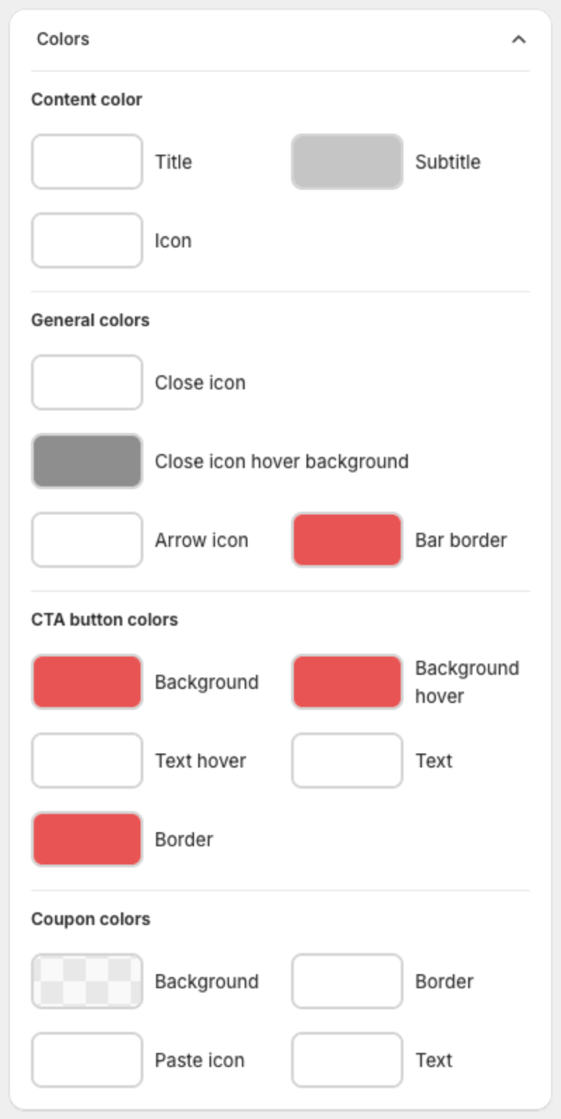
Under Colors, click a swatch to change it:
- Content color: Title, Subtitle, Icon.
- General colors: Close icon, Close icon hover background, Arrow icon, Bar border.
- CTA button colors: Background, Background hover, Text hover, Text, Border.
- Coupon colors: Background, Border, Paste icon, Text.
7. Change the font or other styles with custom CSS (optional)
Under Advanced setting, add your own CSS in Custom CSS. The CSS applies only to this bar.
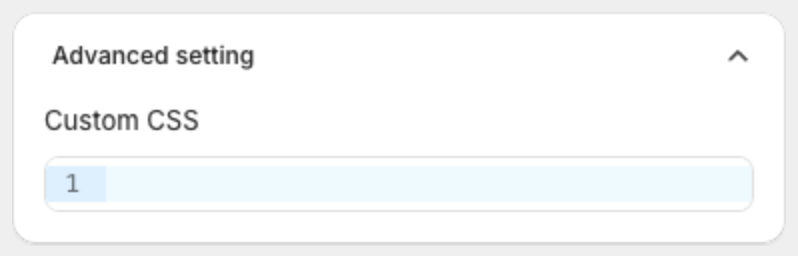
The bar uses your theme's font by default. To use another font, paste this CSS and replace the font name. The font must already be available on your store, for example one of your theme fonts.
.xba__content__title,
.xba__content__subtitle,
.xba__cta {
  font-family: Georgia, serif;
}
Useful class names: .xba__content__title (title), .xba__content__subtitle (subtitle), .xba__cta (button).
8. Save or publish
Click Save in the bar at the top of the page, or click Publish if the bar is still a draft.